
แถบด้านข้าง
Explore All Products

Your 2025 Guide to Phone Case Colors and Back Cover Pairings
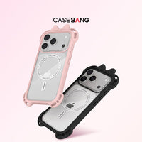
Phone case trends are shifting in 2025. People are no longer choosing a case just because it looks good. They’re choosing colors that express their mood and back covers that show personality. With modular cases rising in popularity, combining base cases and interchangeable back covers has become a true styling decision.
If you own multiple base cases or collect branded and character back covers but often struggle to match them, this guide will help you create pairings that look effortless and intentional. ;)
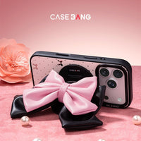
1. Bow Base Case (Pink & Black)
Our newest Bow Base Case is more than just a color option—it’s a full silhouette upgrade. The raised 3D bow corners bring a soft, collectible charm while offering improved drop protection.
The pink bow feels sweet and feminine, perfect for pastel artwork and soft character illustrations.
The black bow delivers stronger contrast and pairs beautifully with bold outlines or darker themes.
Whether you prefer cute or cool, the Bow Base Case instantly adds personality without overwhelming your back cover design.
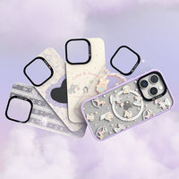
2. Clear Base Cases: Clean, Smooth, and Easy to Pair
Clear bases (white-clear, black-clear, and pink-clear-glitter) are for people who want maximum flexibility with a clean finish.
Clear white brings a bright, minimal appearance that complements pastel and transparent artwork.
Clear black adds a modern cool tone that enhances high-contrast graphics and futuristic themes.
Clear pink glitter has soft sparkles that look beautiful under different lighting, especially with dreamy or pink-toned illustrations.
These smooth-textured clear cases keep the focus on your back cover while adding just the right touch of polish.

3. Blue Base Case: Soft, Cool, and Surprisingly Versatile
Our soft blue base case is a customer favorite for its clean, refreshing tone.
It works especially well with
• transparent or light-colored back covers
• blue or purple illustrations
• glossy, mirror, or subtle glitter effects
• collaborations like Esther Bunny and other gentle, playful styles
Blue has a natural balancing effect, making most designs feel cleaner and more structured. When in doubt, blue offers a simple but polished look. ;)
4. Purple & Yellow Base Cases: Dreamy vs. Bright
Purple and yellow often attract creators who want color with personality.
Purple
Soft, dreamy, and atmospheric.
Works beautifully with
• fantasy-style artwork
• clear glossy designs
• glitter or liquid-sand textures
Yellow
Warm, cheerful, and instantly bright.
Pairs well with
• airy, uplifting illustrations
• pastel graphics that need a warm boost
• simple themed back covers
Purple gives a soft mood.
Yellow brings lively energy.
Both shine best with light, whimsical, or playful artwork.
5. Pink Base Case: The Softest Starting Point
The charm of a pink base case is its gentle glow. It pairs beautifully with
1 light and cute illustrations
2 warm-toned character designs
3 transparent or mirror back covers that allow a hint of pink to show through
4 collections like Mikko or other soft, playful collaborations
Pink works best when the base color participates in the final look instead of being fully hidden.

6. Classic Black Base Case: Always Sharp, Always Reliable
The classic black base case deserves its own space. It is bold, timeless, and works with almost everything.
Black enhances
1 neon or bright designs
2 saturated anime artwork
3 metallic accents
4 clean, minimal illustrations
5 branded collaborations with stronger outlines
It gives every design sharper contrast and a more premium visual weight. If you ever feel unsure about a pairing, black almost never goes wrong.

7. A Quick Note on Other Colors
We also offer red, silver, and green base cases.
They aren’t covered in full sections here, but they’re great choices if you enjoy richer tones or seasonal styling flexibility.
8. Three Rules for Perfect Back Cover Pairing
No matter which base case you choose, these three rules will consistently give you great results.
1. Share one color between the base and the back cover
It creates natural visual harmony.
2. Light-colored back covers fit best with bright or cooler base colors
It keeps the back cover clean and visible.
3. Bold, saturated artwork pairs better with dark or clear bases
This prevents visual clutter and keeps the artwork crisp.
9. The Fun of Modular Phone Cases
What makes modular phone cases so enjoyable is the freedom they give you.
One base case, a few back covers, and suddenly your phone becomes part of your personal style.
You can switch a look in seconds — match your mood, your outfit, or even the theme of your day.
It’s simple, creative, and surprisingly addictive in the best way.
For brands and creators, modular cases also open up endless styling possibilities.
Every new back cover becomes a fresh way for customers to express themselves, and every color combination tells a different story.
That’s the real charm of modular design: you’re not just choosing a phone case, you’re creating your own style identity.